This is an ongoing record of a collaborative design process and learning experience -- a repository of text and images for the purposes of chronicling and sharing our progress.
For the very latest updates, please see the 'Build' section here.
the short of it
We are building a house.
We have an architect drafting construction drawings, an engineer to check the design's structural stability, a builder who's ready to start building in a month, and we have the Clients -- my mother and father. After decades of foreign service, separated from familiar people and places, the folks are looking forward to putting roots down, to retirement, and (potentially) to grandchildren.
As for myself -- an artist with no formal training in architecture -- I fit somewhere in the middle of all these creative forces. Over the course of this project -- which started as a simple remodel and has become a full-blown tear-down and re-build -- my role has shifted dramatically (and quite unexpectedly), from detached observer and occasional critic to brainstormer, napkin-scrawler, CAD-tinkerer, draftsman, designer, and ambassador. Between my parents' ideas, the expertise of the architect, and the dozens of plans and 3D models I've made, it's tough to say who (if anyone) deserves ultimate credit for the final design. It's been a collaborative process, to say the least.
The original plan was to build an addition to the family beach shack. When that idea fell through (a combination of mounting ambitions on my parents' part and dwindling communication on the design/build team's part), my folks decided to take a breather and think about whether they really wanted to start from scratch -- meanwhile, I decided to see if I could use a basic CAD program I was familiar with to mock up and visualize a design.
Here are ten things they knew they wanted:
1. A cottage. A classic New England coast-style cottage. With shingles and dormers. (Like much of Gearhart.) Nothing too fancy, but not bland, either. Something cute and homey and traditional.
2. It has to fit on our lot, of course -- on a buildable area measuring roughly 36 feet wide by 48 feet long -- and must not exceed 2,000 square feet. Also, the underground sand filter septic system in the backyard cannot be built on.
3. The house must be capable of accommodating our entire family -- which, for now, means Mom, Dad, two sisters, two brothers, one niece and one nephew -- with room to spare. In other words, can our quaint little cottage sleep 10+ people?
4. The master bedroom must be on the ground floor. Older knees are not interested in taking the stairs every day. Also, the master suite must have a walk-in closet as well as a bathroom.
5. The living room must be on the southwest corner of the house, where much of the day's sun enters. Also, vaulted ceilings, so that "it feels like a cathedral when you enter". (Somehow I don't normally find "cottage" and "cathedral" lumped together.)
6. Likewise, there must be a smaller, less formal "sun room" with big gridded windows and a place to sit and drink -- which must be on the southeast corner of the house, where much of the morning's sun enters.
7. The kitchen must be in the back of the house with easy access to the backyard, where there will be seating and an outdoor fireplace for cooking. Also, the kitchen must have bar seating, and must be open to the dining area without actually being in the dining area.
8. There must be a mudroom in the back or on the side of the house, for muddy paws and wet shoes.
9. There must be a small office/den for Dad to close the door and make phone calls, write emails, etc.
10. Together with the living room's vaulted ceiling must be a loft which looks down to the living room below (a nod to a house we had in Sunriver, OR).
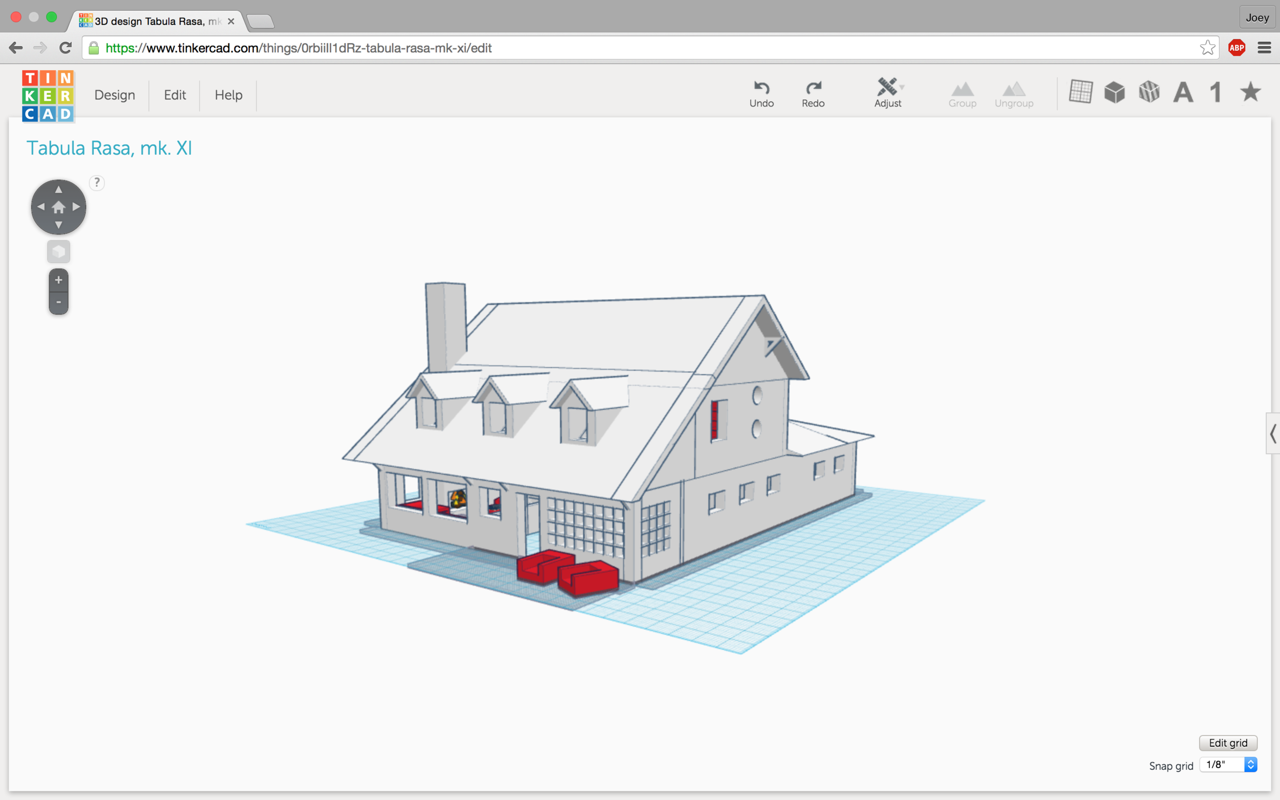
From this set of requirements, and in constant consultation with my folks, I made about a dozen 3D models over the course of five months (November 2014 - March 2015). I found it easier to improvise, visualize, and communicate designs with TinkerCAD before moving on to more conventionally drawn floorplans and elevations. Eventually, when the time came for less brainstorming and more precision, I translated the 3D models into 2D diagrams, which the architect could then translate again into formal CAD schematics.
As of April 2015, we intend to have construction begin in May and end in time for Thanksgiving.
CLICK HERE TO VIEW 3D MODEL
the long of it
The western face + front deck. The darker shingles are probably where an old chimney used to stand.
Some time in the 1940s or '50s, an officer's quarters at Fort Stevens was uprooted and driven twelve miles down the northern Oregon coast on US-101 to its current home in Gearhart (pop. 1,500). It was built to last five years. Nearly 70 years later, it has changed hands -- from the family whose home it had been for the better part of the twentieth century to my mother and father -- and after two years of happy use, it is facing the very likely possibility that the time has come for it to kick the bucket.
From the back. Pretty much everything under the tree's shadow is occupied by the house's sand-filter septic system -- and can't be built on.
Which begs the question, of course -- what would go in its place? I doubt we are leaving Gearhart any time soon; our family has been coming here since we were all kids -- since my brother and my cousins and I were kids (1980s, 1990s), and since my father and my aunts were kids (1950s, 1960s). The old family condo came and went, but after a gap of a little less than 10 years, this is what, for better or worse, has taken its place. But when it comes to housing more than three people at a time, we've decided that the current "officer's quarters" doesn't quite cut it.
Our first idea was to add a tiny house -- a supplementary structure (or "auxiliary dwelling unit" in Portland terms) that could sleep up to four people if necessary. Aside from being relatively quick and inexpensive, there was the simple convenience of leaving the original structure more or less untouched. The lot is long and narrow; one of my first ideas was to build an ADU in front, near the street. This then placed the front deck between the two structures and would create (I thought) I nice courtyard feel:
View from the street -- it's the little one that almost looks like it could be the neighbor's garage.
As my phrasing in the drawing probably makes clear, our ideas at the time ranged from 'adding a small guest house' to 'demolishing everything and starting anew'. We really liked the casual, thrown-off, lived-in, almost spontaneous nature of the 'shack' as it is -- most of the time. It's just a beach house. Right? It's almost like camping! Cozy. Fun. Modest. The size of the structure fits the size of the lot. You'd almost miss it if you drove past and didn't know that we lived there, sometimes. But the real (maybe less than obvious) point: the size of the place fits the size of our use of it. Because when, realistically, will we ever have 7-10 people staying here all at once? We usually come here on weekends, maybe up to one or two full weeks at a time. This -- very flexible maximum occupancy -- was the main requirement for whatever new design solution we came up with.
I had spent some recent time in Japan -- masters of the finely-crafted, ingeniously-designed tiny living space. And Portland of course has made a name for itself with its ADUs -- they are everywhere, and for good reason. Wouldn't much of our existential climate change crises be softened if we could somehow wean ourselves off of our consu/materialist mentality? If we could only just decide together that we really don't need 90% of the material stuff we own -- square footage included? The plan above, to me, represented a nice combination of practical needs, an idealistic philosophy, and minimal financial investment. When stars align like that, when not two but three birds can be killed with one stone like that, I think we can fairly say that it just make sense.
No. Instead, we find that Gearhart's limits on setbacks preclude us from realistically considering this plan. Too bad.
So we hired an architect. While we weren't allowed to build too close to the street -- or in the backyard, where the underground sand-filter septic system was -- we were allowed to squeeze another structure alongside the current one. Two narrow eel-beds, side by side. I wasn't enamored of the concept at all -- in this context it was a clumsy, inelegant solution. The space was small enough as it was. Plans were drawn up. Eventually it was decided that it didn't make much sense to have the structures separate, given the size and shape of the lot. So they were combined -- what we had now was an addition. We could no longer stay in the house while an ADU was being built. At this point, why not move the kitchen from the front of the house to the back? Why not give ourselves a walk-in closet? Might as well make it a full-on renovation. And then why not tear down this wall and that wall too -- or 80% of the current structure? Why renovate at all?
The last plans we got didn't exactly inspire confidence. My parents can be picky people, but they can also (understandably) have difficulty envisioning and articulating what it is, exactly, they want. (That's why we hire designers and architects to do the work for us.) The mission had creeped considerably, so I don't know that much blame deserves to be placed with the architect and builder we were working with at the time (or anyone in particular, really). All I'll say is that the roofline was (predictably) weird, they were gonna have to re-work the great majority of the house, and it simply didn't fit what (I'm pretty sure I knew) they were trying so hard to imagine: a unified, cohesive design for a simple (but sizable) beach cottage. (With a sun-room on the south side, a kitchen in the back, the master suite on the bottom floor, and enough beds to sleep my brother, my two sisters, my niece and nephew...) We have to remember: this old house was designed to last five years, and was built in the 40s. If we're gonna do this much work on the thing, why keep any of it?
The straw that broke the camel's back was a long-delayed consultation with a few folks from Cannon Beach -- second and third opinions. They said: (a) don't build an addition onto this old thing -- we don't know what we'll find once we start tearing things up -- and (b) if you want as much as you want (new kitchen, new bedrooms, etc.), then your only real choice is to tear it down and start anew. (What had I been saying since the beginning? Preserve the original structure only if all you'll build is a tiny house -- emphasis on tiny -- any more than that, and it only makes sense to design with a clean slate.) Back to the drawing board.
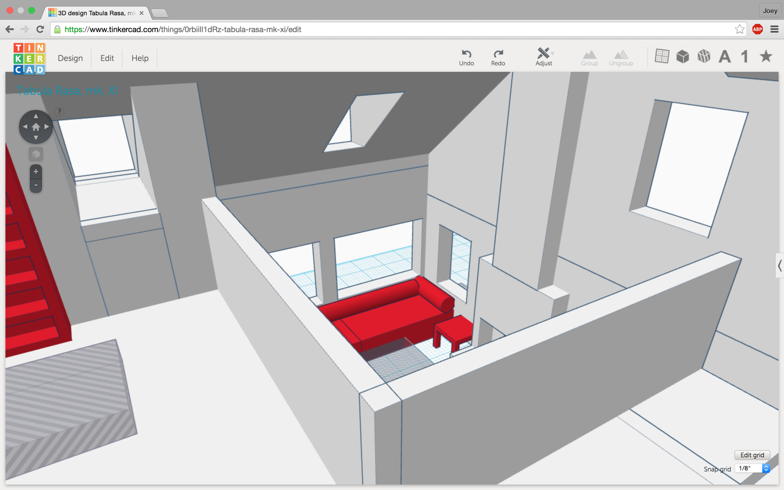
One of my first attempts (complete with solar panels) -- and TinkerCAD in all its simplistic (elegant-ish) glory.
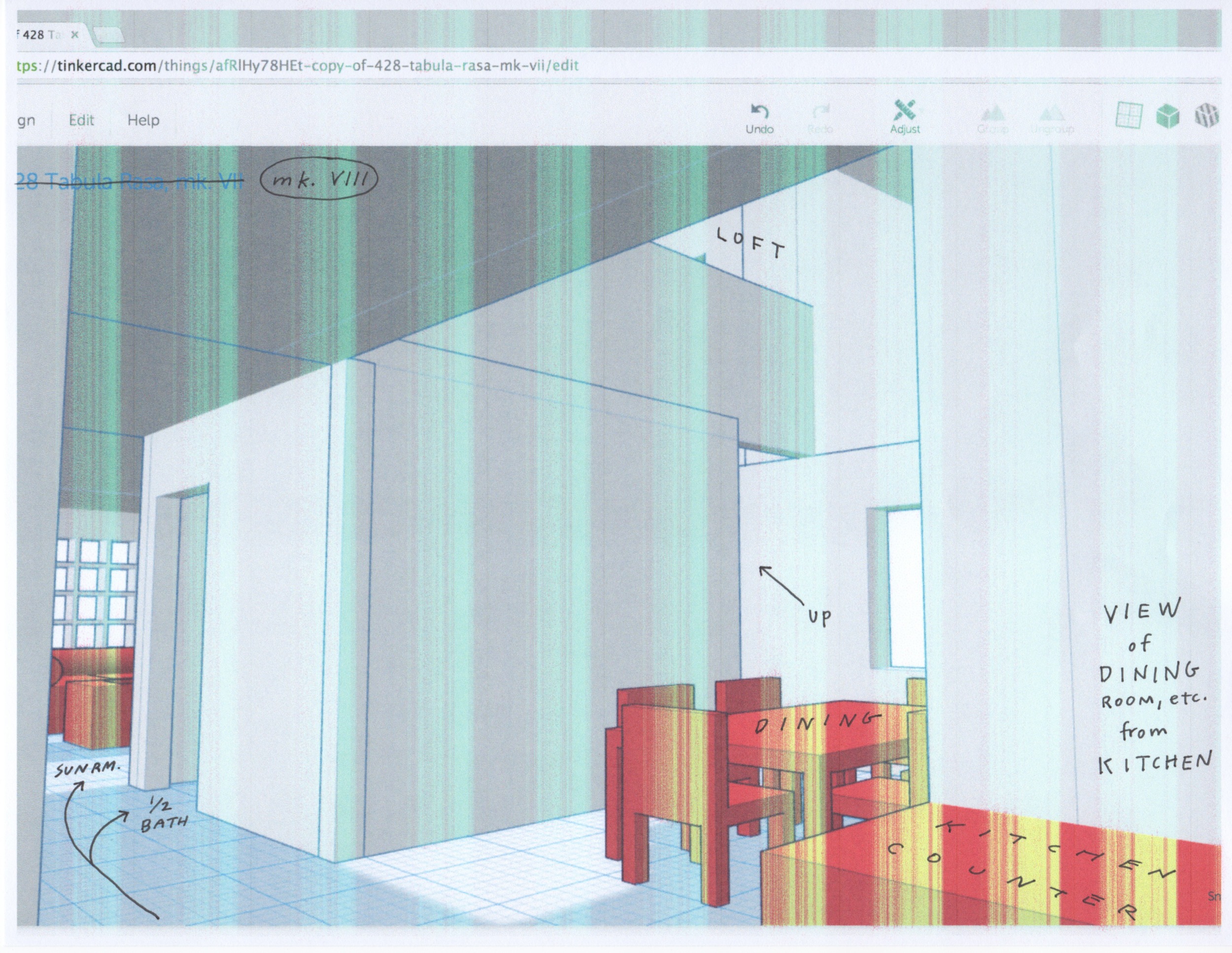
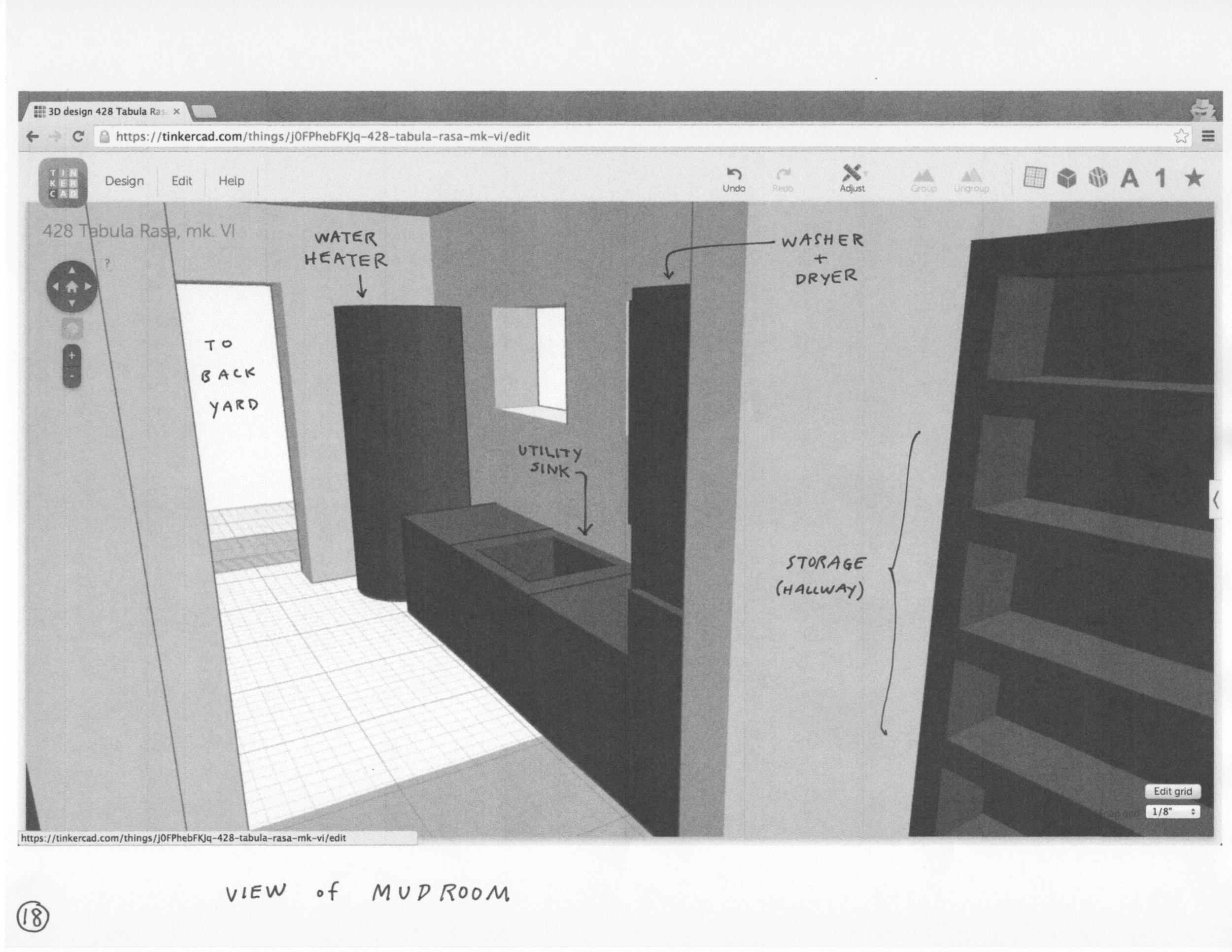
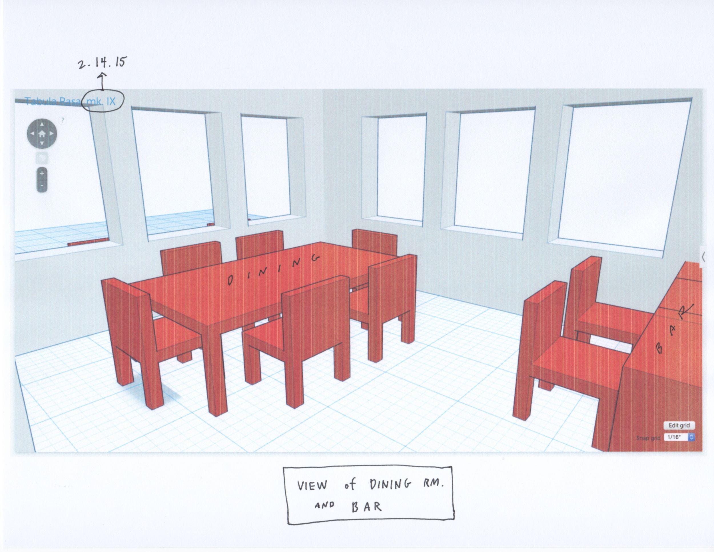
So back to the drawing board I went -- and soon found myself moving cubes around in TinkerCAD, stretching and shrinking them into walls and floors and roofs, alternating forms between solids and 'holes' (i.e., doors and windows). "From mind to design in minutes" is (or was) TinkerCAD's slogan, and I found it to be very apt -- rather than brainstorming, sketching plans beforehand, erasing and re-drawing as necessary, trying to imagine how the roof would look, and only then moving into dedicated CAD programs for 3D modeling, etc., here, instead, I had a superlatively intuitive and seamless way of designing directly in three dimensions that allowed me to collapse and unify the process. I drew 2D plans by hand (a) only after I had continually tweaked, and was happy with, the virtual model I made beforehand, and (b) because I had to -- since TinkerCAD is designed primarily for (pretty simple) 3D printing, it doesn't come with any provision for rendering two-dimensional diagrams.
But maybe more importantly (than however I felt about this new design process), here was relatable imagery -- rather than my (non-designer) parents having to mentally translate two-dimensional schematics into a mind's-eye 3D model, I could easily simulate and communicate views of the house as if they were actually standing on the front porch, in the living room, in the kitchen, etc. The only heavy lifting I had to do (if you could even call it that) was converting the diminutive measurement units they used for 3D printing into real-life inches and feet. (Third-grade math.) TinkerCAD is browser-based, and free. I don't often rave about the church of high tech, but for these guys I'll make a no-bones exception.
An early presentation layout (and early floor plan) I put together for my folks.
Of course, these aren't construction drawings -- and neither are they drawn by someone with any formal training in architecture. I don't know where the pipes or the vents or the wires go, or what kind of lumber needs to be used where. But finally -- after a bit of software familiarization and a fair amount of iteration, and most of all after having been in constant consultation with my folks (communication being the big thing they've come out of this experience with big new eyes about) -- I think we finally have a design they have no complaints about. Which, to me, translates as something they can more or less be happy with.
(I still have my qualms about squeezing the amount of square-footage they want -- 2,000 +/- 100 -- into our skinny little lot, but I believe we're much better along than we were.)
What we did from here was hand off the following images -- and a link to the 3D model itself -- to the new architect. The plan is for him to refine and formalize these plans. We hope to have the new Gearhart house built some time in the next year.
update #1
Here is what we got back from our new architect after consulting with him and giving him the images I've shared above. A few changes: (a) the kitchen now has a 6' sliding door, in addition to the French doors in the dining room, (b) the kitchen has considerably less counter space and also now contains a pantry, (c) the pantry hall and mudroom have been shrunk and consolidated into one utility room, (d) the master bedroom opens out into the same space as the central hallway and dining room, (e) the back door to the utility room now has a 7 x 7' porch, (f) there is a cabinet in the dining room under the stairs, (g) the den upstairs has been expanded (and is actually bigger than the guest room). At the moment we are still considering the changes and aren't feeling especially swayed one way or the other yet.
update #2
Looking at both my plans and the architect's with new eyes and clearer heads, the folks have asked for a few changes: (a) kitchen and dining room as one open space, communal yet distinctly separate, (b) kitchen with double-doors opening out on to the eastern side of the backyard where the fire-pit will be, (c) bar-style counter and stools in addition to a proper dining table. Here is what I came up with:
I traced over the architect's sketch so we could make direct comparisons.
KEY:
F = furnace
W+D = washer and dryer (stacked)
R = refrigerator
O. x2 = double oven
B. Block = butcher block
update #3
After sleeping on it, and walking a bit around Gearhart, I've made a few more changes before we meet with the architect for a second time.
1. The front deck is now enclosed. This makes it more of a 'true' sun-room -- a couple chairs, a table or two, lots of plants, rustic decor, etc. I sat out on this corner this morning (one of those 60+ degree days) and thought it'd be a real shame if we didn't make something really nice right here. I think this is what the Client had in mind for a "sun-room" -- not a communal living room that tried to pass itself off as a sun-room. This is a more intimate, down-to-earth space, and should be perfect for coffee/tea and sunny mornings.
2. As a result, the main entrance is now squarely in the center of the front face of the house. The exterior of the ground level should now appear symmetrical.
3. The staircase has been mirrored and rotated 180 degrees. Instead of having to go through the utility room to go upstairs, we can now access it through the living room. Another small benefit is that reaching the top landing is a little less anti-climactic, giving you a view of the open living room and its vaulted ceiling.
4. The fireplace has shrunk and has been shifted slightly south in order to accomodate the space needed to move into that back corner where the staircase is.
Here is a sketch I made when I was trying to envision what a warm, enclosed, sun- and plant-filled room on the SE corner of the house might look like.
update #4
After sleeping on it again, drawing a modified plan in the morning, meeting with the architect in the afternoon, and re-drawing it with all the changes we talked about, this is what we have. I think we're just about 95% certain that this is the plan we'll go ahead with.
Changes:
1. Foyer and sun-room have been consolidated into one open space; main entry has been shifted east, to about 2/3 of the width of the structure.
2. Double doors previously in the kitchen have been re-located to the dining area. This adds counter space in the kitchen and re-directs foot traffic from the 'work zone' to the 'entertaining zone'. Tentatively: kitchen access to the back patio is retained with a single door (this may or may not survive, come construction).
3. Dining area and foyer each gain a built-in bench.
4. Central hallway has been narrowed 6 - 12" in the interest of keeping a tidy footprint.
We also talked a bit about how all this might affect the second level (which I haven't been paying as much attention to lately). I may try a few things out in TinkerCAD, but at this point I think we're feeling pretty comfortable about leaving the rest of the work to the architect. (Of course, I have felt this way before, and since then feel like we've still come a long way.)
Mostly, I've shied away from making provisions for every one of my Client's requests (Mom's need for various features) in favor of my other Client's requests (Dad's need to keep square footage and costs down). But at this point, I think Mom is winning.
update #5
I reconfigured the second level since the old plan was kind of a holdover from when the dining room was vaulted and separate from the kitchen. I think this makes much more sense -- and I feel particularly attached to the more livable loft area (with the sofa-bed) which is open to the living room below.
Changes:
1. I trimmed 7x7' squares from the east and west sides, and pushed a 20x5' rectangle north.
2. I knocked down two long walls which ran east-west.
3. The bathroom is now located directly above the utility room (and part of the dining area).
4. The den has been chopped in half -- Dad does not need a big room, just space enough for a desk and a closed door -- and in (part of) its place is a more livable loft area / reading nook, which is open to the vaulted living room below. (We had a loft like this in Sunriver, and with a sofa-bed it worked as a de facto guest room.)
5. The guest bedroom and bunk room are now a little less long and narrow in shape.
6. The wall between the bathroom and guest room should correspond with the wall below it between the hallway and the utility room; the west wall of the bunk room should correspond with the wall below it between the hallway and the master bedroom; the wall between the loft and the den should correspond with the wall below it between the master closet and master bath.
update #6
After playing around with the second level floorplan, the next challenge has been the shape of the roof. Out of simple curiosity -- just to see if I could do it (and I think I did OK on some of my previous designs) -- I've been trying my hand at working out a sensible roof shape. I'll defer to the expertise of the architect on this one. It hasn't been the especially easy, but this represents one of my better attempts so far. It might be a bit hodge-podge back to front but I don't think it would be difficult to fix up the back -- the front was harder to figure out. Anyway, I certainly wouldn't be surprised if we end up with something different.
While I was at it, I also updated the model's interior, to better represent the most recent plans.
And finally, for the completionist in me, and the executive summary for you:
- a link to the 3D model (which you can explore and zoom around using your mouse and the shift key),
- and the most recent floorplans side-by-side.
I will leave visual consistency to the architect and his CAD program.
update #7
ELEVATIONS.
The architect's:
I just traced over the architect's CAD rendering, and extrapolated what the top would look like.
JLE's:
I modeled this in TinkerCAD first and then converted measurements as I made the drawing.
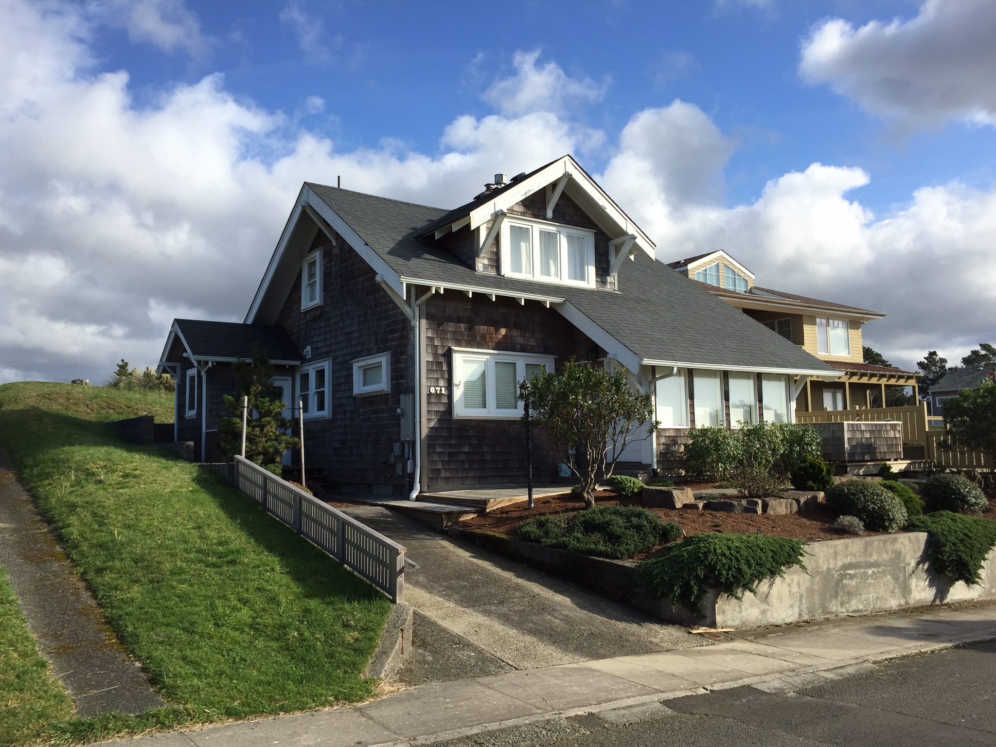
This drawing is representative of the Client's central aesthetic requirement: that it look (especially from the front) like a classic, quaint Gearhouse-style beach cottage. One feature frequently requested was the dormer -- in this configuration, with the roof sloping in front, we get one larger shed dormer with five windows (from the left, the first two would act like skylights over the open living room, the next two are in the loft's sitting area, and the last one is in the office/den). Another feature/detail often mentioned by the Client was the corbel, or console (under the eaves). Structurally, we'll have to defer to the architect of course -- but I imagine this design, with its perpendicular ridges, is more complex (and more expensive).
Here are two houses in our area of Gearhart which illustrate some of these points.
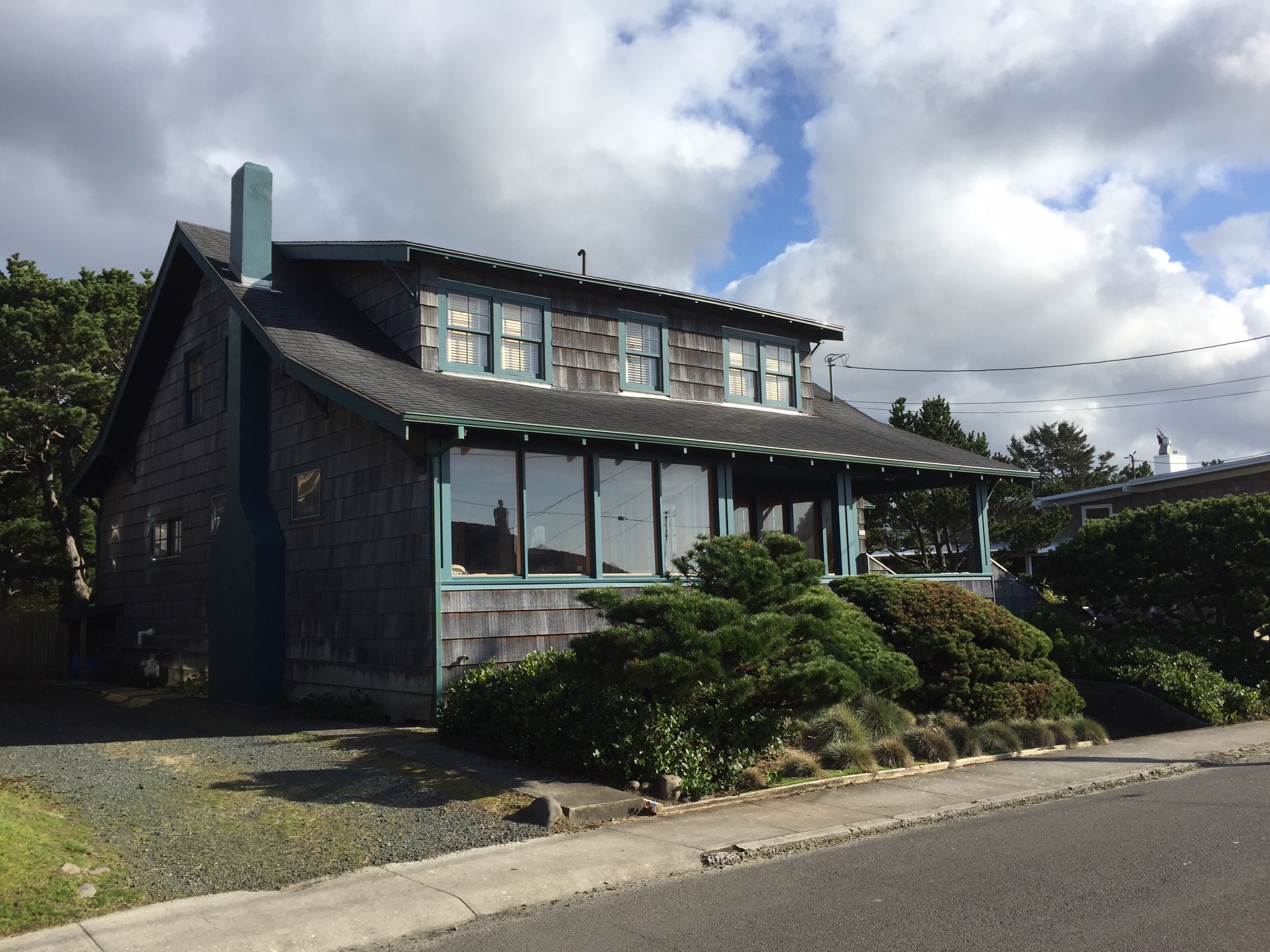
Lastly, a link to the TinkerCAD model I used for the elevation drawings. (The only real differences between this one and the one in Update #6 are the dormers, and the shape of the roof in the back).
update #8
Since we'd been referring to a combination of freehand sketches, CAD print-outs, and TinkerCAD screenshots, I decided to re-draw the floorplans in a way that was visually consistent with the elevations drawing I did a few days ago. Both were drawn with Micron pens on 11 x 17" bristol. With these two drawings as an easy reference, the Client -- or anyone who isn't familiar with the project -- should be able to get a lay of the land in one quick look.
update #9
Now I'm beginning to micro-manage. I've made a list of changes that need to be made from the architect's current floorplans. Most of them are details and shouldn't affect the permit process in any way, but a few do affect the exterior appearance, as well as how the house will actually be used.
I've listed the changes in order of importance.
A: We've decided to get rid of the door in the kitchen in favor of increased counter space. (Two sets of doors so close to each other which open out to the same area -- pretty redundant.)
B: Partial wall in the loft. The architect's rendering has this as a solid wall -- we would like to be able to look down from this area.
C: This one has three parts. In the architect's plan, this closet under the stairs opens out into the living room. Problem is, we would like to use this entire wall for built-in shelves (books, TV, decor). So -- (1) remove the door in the living room, (2) put it in the powder room, (3) put built-in shelves along living room wall.
D, E, F, G: The size, shape, and placement of these windows all affect how the house will look from outside. D: Large gridded windows for the sun-room, almost like a greenhouse. The smaller one on the side (east) isn't in the architect's rendering. E: The two larger windows in the living room aren't this large in the architect's drawing. Also, I thought the single window which looks down the length of the house through the central hallway ought to be square, for purely aesthetic reasons. If you look at my elevations drawing, I think this variety of shapes and sizes handles the ground floor's asymmetry by providing more of a sense of rhythm. F: These five smaller windows from the shed dormer, on the other hand, are equally spaced and placed symmetrically. G: Likewise, these three windows in the back form a cohesive, symmetrical set from the exterior -- in spite of serving two different rooms inside (in the architect's plan there is just one window on the eastern end of this whole wall).
H: Laundry chute. I thought we could put a little door on the outside of the upstairs bathroom, while the hole itself goes straight down from the corner of that bathroom to the center of the utility room below -- right in front of the washer/dryer.
I: The washer/dryer itself should be a vertically stacked unit. (In the architect's drawing they are side by side.) This provides more counter space.
J: I thought this wall in the dining room would be a good space for more built-in shelves / cabinets -- plates, napkins, condiments, etc. Obviously this frees up the kitchen and pantry from having to store these kinds of things.
K: These double doors should open out onto the backyard -- not in, as they are drawn in the architect's plan.
L: Not a change so much as a note -- the bar should have two tiers: higher on the dining side and lower on the kitchen side. The Client claims this will hide the kitchen's mess from dining area.
M: The Client has also requested that the fridge and adjacent counter space be switched so that the fridge is more in the kitchen than out in the communal area.
N: Now we're getting into the nitty-picky (if we haven't already). I thought the door to the pantry would be more convenient as a sliding pocket-door than one which swings in/out.
O, P, Q, R: Placement of various windows. O: These windows ought to be placed more in the center of the master bedroom than they are in the architect's drawing (where they are clumped together on the south side of the room). P: This window in the stairwell corresponds with the larger window in the bunk-room, again more for external symmetry than anything else. Q: Just a couple more windows in the guest bedroom -- optional really, but this NE corner of the house may be the darkest. R: Bunk-room windows -- a larger one which faces north (corresponding to the one in the stairwell), and two smaller porthole windows (arranged vertically) for the lucky sailors bunked on the east side of the room.
update #10
Ten "updates" later and I think we can say that our design is finalized. Since sending the architect my suggestions for the elevations and for little changes here and there, as well as since having conferred with him this week (3/31), it looks like the wheels are set in motion to create construction drawings, get permits, and start building within one month's time -- May 2015. A new house? Thanksgiving 2015.
Rather than re-draw the plans or post the architect's files online, I'll refer you again to the most recent TinkerCAD model:
https://tinkercad.com/things/j3D2efGgTCl
(Click on the "View 3D" button. Using your mouse, click and hold to rotate the camera; hold shift and click to move the camera; use the scroll wheel to zoom in and out.)
update #11
3D PRINTS.
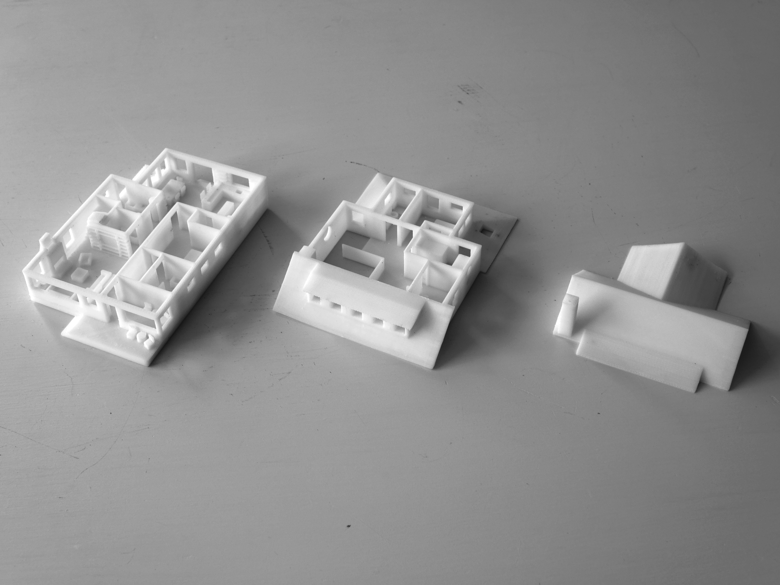
I finally took the time to put TinkerCAD to its intended use -- making models for 3D printing.
I had a number of false starts -- the first was just sort of blindly printing the model I had without taking into account all the supports that would have to be printed (under tables and chairs especially), thereby making for a much 'messier' print, with little annoying bits of plastic hanging off everything; the second was finding that only one of my 3D printer's plates really works now for printing this 'large' (laughable considering the final product measures 4.5 x 3 x 2") -- the others seem to have trouble dispersing heat evenly across the plate, which leads to one side or corner of the print not being warm enough to adhere properly to the plate, which leads to the print detaching and curling up and screwing up the whole thing, sometimes even dislodging the print entirely from the plate; and after a few of those, finding that I didn't have enough plastic on my spool and needing to order and wait for a new one.
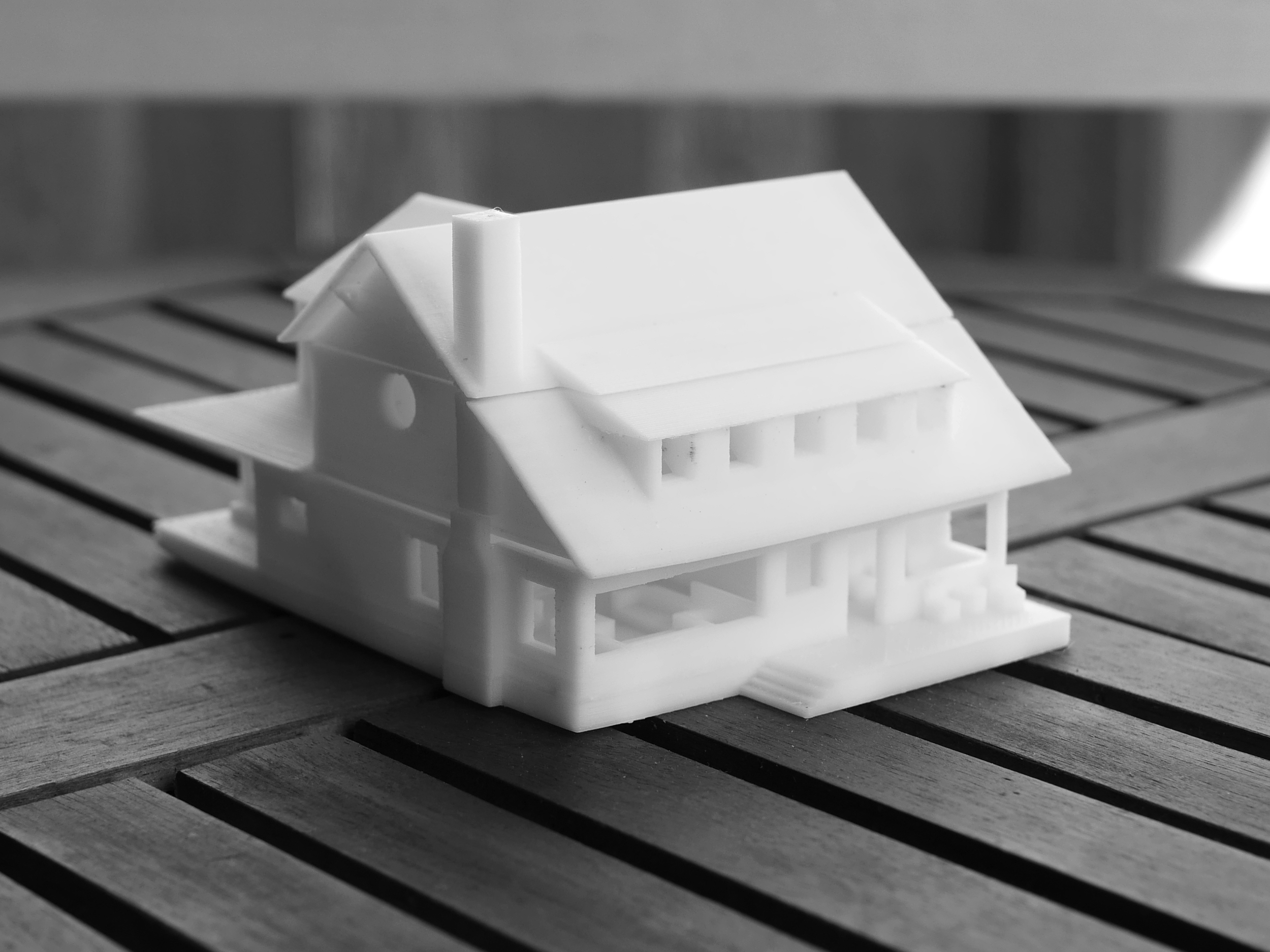
Eventually, though, the machine and I hit our stride and we churned out the three individual prints you see above: the ground floor (7 hours of print time), the second floor (5 hours of print time), and the roof (2 hours of print time). Then I spent maybe two hours peeling, stripping, carving, and whittling off all the excess support structures of the print. Personally I find this last stage of printing to be not just the worst (which is only relative), but actually very very aggravating. It's not something you can just plow through -- one false move can cut or snap the entire model into pieces, it can be very delicate work, and yet at the same time parts of these structures adhere just as strongly to the model as any other part of the model. I can't wait until they figure out how to do away with this part of the process.
Originally, I'd planned to have the three pieces snap together like lids on a box, but found that the size (too small) and resolution (not fine enough) of the print weren't conducive that idea. So they just sort of float, stacked one on top of the other. I might be able to design a way for tiny rare earth magnets to fit in future models. And if I really wanted to, I could increase the scale of the prints -- but I'd have to divide each 'piece' further into halves or quarters (gluing them together later), thereby doubling or quadrupling the amount of work and materials. Not really worth it, in my book.
In all, though, this has turned out to be one of the best prints I've turned out on my Up Plus 2 printer -- and maybe the most useful for real-world applications. We had a few builders in our backyard this week building a shed -- one of them came in asking to plug in an extension cord and saw the machine at work. When I told him what I was doing, he lit up, saying the company could use this to show clients models of the houses they planned to build -- for the same initial reason I started designing this house for my parents: not everyone can read a plan or look at elevations and really get a sense of what the house will look like, and many times it won't be well into the construction process that clients finally start to get it... and start changing their minds. Now, instead, they can hold a little plastic maquette in the palm of their hands before any concrete is poured.
update #12
PROPOSAL FOR MODIFYING FRONT ENTRY + STAIRS
We would like to modify the layout of the front entry and the stairs.
The current plan’s front entry is problematic for two reasons: it isn’t very straightforward, and it isn’t especially well-sheltered from the elements. We would rather place a single front door in a recessed area located in the center of the front face of the house.
[Note! This is very close to what I had originally designed in February -- see Update #3]
The current plan’s staircase is problematic for two reasons: it takes up valuable wall space in the living room (making the placement of the built-in bookcase awkward and off-center), and it requires that a 15 x 4’ area of the living room be clear for passage. We would rather place the staircase in the hallway in order to clear the entire north wall of the living room for the built-in bookcase, and to clear that 15 x 4’ passage area for a more spacious, functional, and self-contained living room.
In my drawings for the staircase re-configuration, I tried to keep as much of the original plan intact -- in particular, leaving various posts, the electrical panel, and the two shear walls in the utility room untouched. However, I’m not sure how the recessed front entry will affect the structural elements at the center of the front face of the house. In any case, the drawing does represent our ideal outcome (however feasible).
There are two main changes to the first floor:
1. The front entry -- we want a more natural and straightforward way of entering the house.
1a. The two front doors no longer exist; the front entry is now located directly in the center of the house.
1b. The front entry has been bumped in by 2', giving us approximately 5 x 5’ of shelter. (Not sure what this means for the shear walls located here.)
1c. The L-shaped half-wall and built-in bench no longer exist; in their place is a straight 7' half-wall, giving us a 12.5 x 5.5’ entry area.
1d. The sun room now has a third window in its south wall, where the first of the two front doors used to be.
2. The stairs -- we want a more spacious, more cozy, more self-contained, and more aesthetically pleasing living room.
2a. The stairs have been removed from the northwest corner of the living room, clearing a 15 x 4’ area of otherwise unusable passage space.
2b. The built-in bookcase along the north wall of the living room now spans the entire length of the living room, which, as defined on the east side by the 7’ half-wall in the entryway, only measures 12.5' east-west -- really emphasizing the need to define this space better and to de-clutter it of any unnecessary pedestrian traffic.
2c. The staircase has changed in shape (from a 'U' to an 'L'), and is now located between the living room and the utility room, keeping it out of the way and making the hallway more functional and less of a 'dead' space.
2d. The utility room has been split in two since the staircase now runs through what used to be a 7.5 x 3' section of the old utility room. The new utility room (14.5 x 5.25') still serves its two primary functions: mud room and laundry room. The washer and dryer are located under the counter, which (not counting the sink) measures 8'. The original floor plan’s shear walls have been left completely intact.
2e. The 'second' utility room (7.5 x 5.25') is located south of the stairs, just outside the new powder room, and serves two secondary functions of the old utility room: as a place for the furnace, and as storage (5 x 2’) for linens and cleaning supplies.
2f. The powder room (6.25 x 5.25’) is now located directly west of its former location, where the old U-shaped staircase used to be, and now has a window. There should also be room under the stairs (north of the toilet) for a small (2 x 3’) closet. If necessary, the powder room and the second utility room may switch places.
There are two minor changes to the second floor:
1. New bedroom wall.
1a. The wall between the bedroom and the loft needs to be pushed north into the bedroom by 3’ to make way for the new staircase and a new door to the bathroom.
1b. This new wall, which spans the length of the bedroom (13.5’ east-west), changes the dimensions of the bedroom closet from 9 x 2’ to 6.5 x 3’.
2. New doors to the bedroom and bathroom.
2a. The bathroom’s door is now located in a new 3’ wall between the new staircase and the new 13.5’ wall, making the bathroom slightly L-shaped.
2b. The door to the bedroom is now located 3’ to the east (directly under the ridge of the roof).
update #13
June 2015
I'm starting a new mega blog post (subtitled "Build") to document construction. You can see that here.


